Less is more - the Art of Web Design
I was checking our blogs and came across an entry from one of our members in the Marketing/PR category. Alas, I lost the link, being preoccupied in fixing a software bug. Nevertheless, the gist of the argument stuck with me. The blogger's issue was that marketeers whether at a trade show or on website should know better than clutter up the message. It was the lack of knowledge on the power of whitespace and how it was rarely used. Too often we feel we would lose our viewer's attention and proceed to ply him/her with a zillion quotes, options, features in the hope that he/she won't go away. Rather it is to take a single concept so powerful with a compelling simple message and draw the viewer into your experience by not supplying all the details. The simplicity of the Google search page is an example of clean design and they resisted to go to the Yahoo paradigm that more is better.
Taking the lesson to heart, we revamped our front page (sometimes staring at the same homepage numbs any pain that may be there!) Too many features, quotes etc. Rather, it should have been... if you have a blog that sizzles, we could ignite it to be a raging masterpiece!
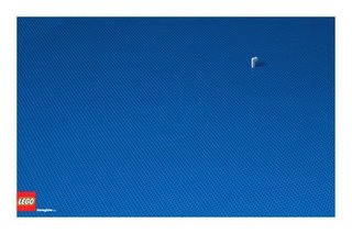
The ad that won the Cannes Grand Prix this year was an ad for Lego at the top of this post. If it looks obscure, it represents a submarine! I think these Lego ads were better.


0 Comments:
Post a Comment
<< Home